 Forms
Forms
Turn any character-sheet image into a playable, fillable form: text fields, checkboxes, dice buttons and live stats, laid directly over the artwork.
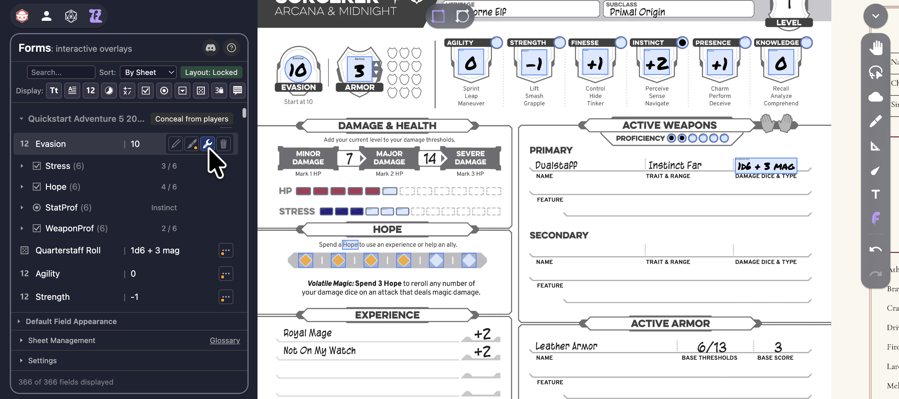
Forms is an Owlbear Rodeo extension inspired by Adobe Acrobat form fields. In Build mode, the GM draws data-entry fields straight onto a character sheet, handout, or prop that's been added as a Character-layer image, and chooses what type of fields they will be (eg. text, number, checkbox, button, etc); then in Play mode, players fill in their sheet's values, tick the relevant checkboxes, click buttons to roll dice, and read reference notes. Every value lives in the Scene's own metadata, so a sheet you build once is there every time the Room loads: filled in and exactly as you left it.
Why Forms?
Most VTT character sheets live in a separate panel, a PDF, or another browser tab, disconnected from the map everyone is looking at. Forms puts the sheet on the table:
The GM uploads a character-sheet image, a spell card, an inventory page, or a faction dossier, then draws fields directly onto it: a name box here, an HP counter there, a row of saving-throw checkboxes, a button that rolls initiative. Players click a field and type, tick a box, press a button and watch the dice land. A derived field can total up ability modifiers automatically. A StatView field can mirror a token's HP from another extension. A tooltip field can surface lore and rules wherever they're referenced. Nothing leaves the Room.
Furthermore, many indy TTRPGs do not yet have full digital character sheet support - Forms resolves that by allowing any image to be upgraded with the game-specific stat, resource, and action fields that you define, making it easy to run specialist and niche games in Owlbear Rodeo with confidence.
The result is an interactive handout that behaves like a real form, owned by the right player, persisting across sessions, with no separate app to keep in sync.
Getting Started
1. Install the Extension
Copy the Forms manifest URL:
https://forms.several-record.com/manifest.json
Then head to your Owlbear Rodeo Room's Extras menu → Extensions → + (Add Custom Extension), paste the URL, and confirm.
2. Configure Your Room
In the Extensions popover, make sure Forms is toggled on for this Room. You should see the  Forms icon appear in the top-left extension Action tray.
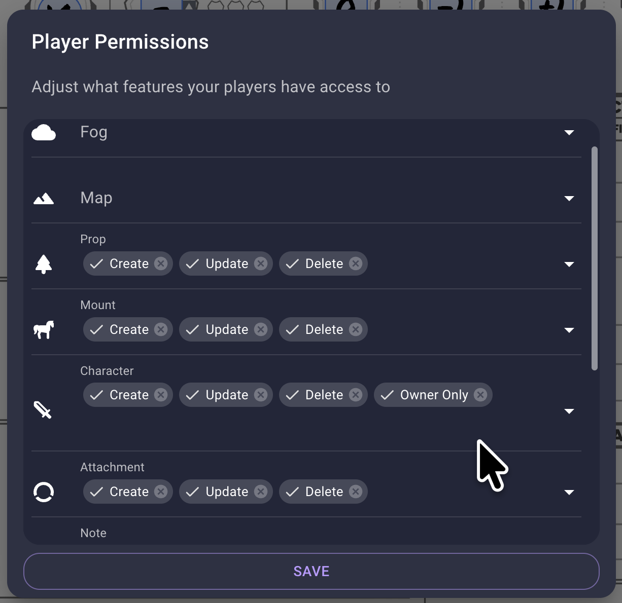
In OBR's player list, open the Player Permissions popover and ensure that the Owner Only permission is set for Character-layer items - this ensures that a Forms character sheet assigned to a player is protected from any changes by other players. (Players will also need the Update permission for Character layer items, which is usually enabled by default anyway.) If the permissions are not set properly, an orange warning notification will appear for the GM (but you can still continue without the full layout protection).
3. Build Your First Field
- Add a character-sheet (or any) image to the Scene on the Character layer
- Enable Build mode in the right-hand toolbar, and if you want to see your fields listed as you make them then also open the Forms popover (with its icon in the top left corner)
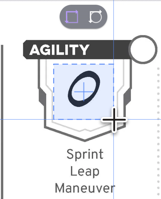
- Click-drag to draw a rectangle or circle shape over the part of the image where the field should sit:
- A Configure Field popover opens, pick a field Type from the eleven buttons (checking the hover tooltips for details on each), give the field a Label and any other initial values that you want, and then Save:
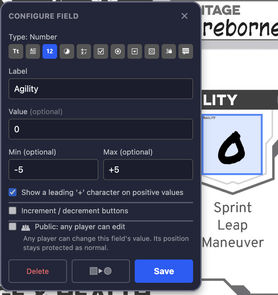
- Toggle Build mode off by selecting any other toolset (like the core Move tool) to return to Play mode, then click on the field to fill it in - you'll see that clicking on the field in Play mode doesn't leave it selected but instead produces an Edit Field popover where you can see the field's stored value and change it
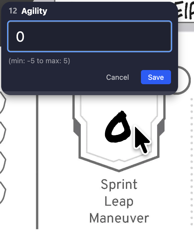
- Assign ownership of the sheet image to any player (using OBR's core 'Character: Owner Only' feature in its Player Permissions), and they gain edit permission on all those fields:
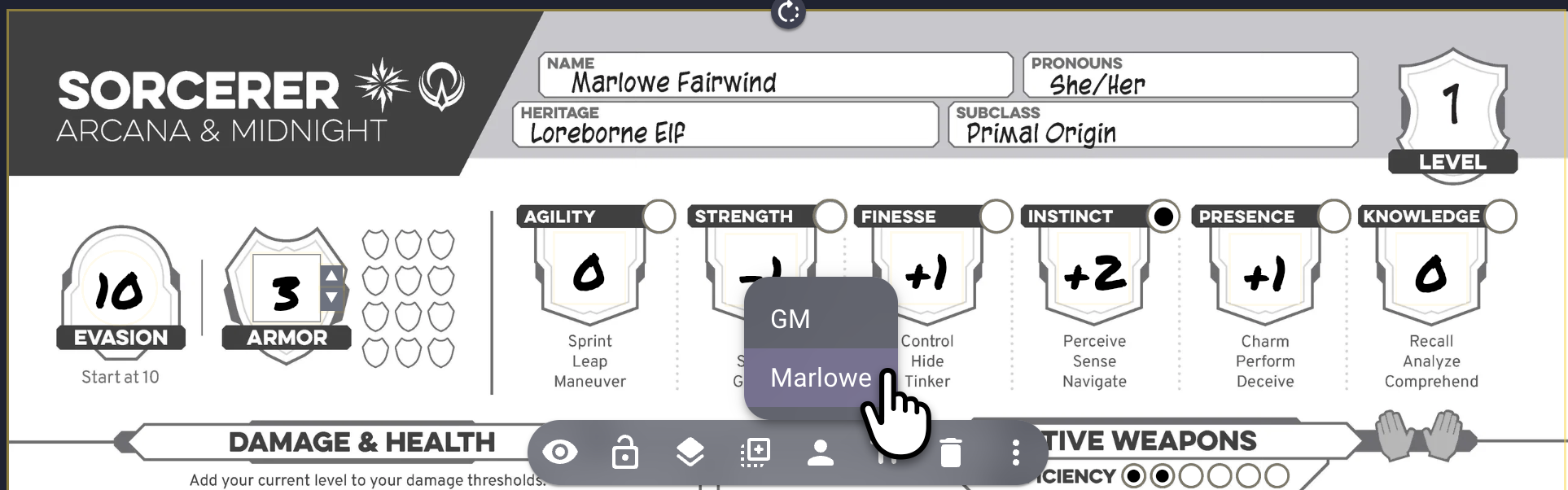
That's the whole loop: draw, configure, play.
Build Mode vs Play Mode
Forms has two modes, controlled by the dedicated Build toolset in the right-hand toolbar.
Build mode (GM only) is enabled when the toolset is active, and it's where fields are created and configured:
- Choose between Rectangle or Ellipse field shapes in the top toolbar
- In Build mode all fields have a light-blue highlight on them, so that you alone can see at a glance where they all are, and what parts of the character sheet still need a field
- Click-drag on a sheet image to draw a new field's bounding box, holding the Shift key to lock the shape's aspect ratio into a square or a circle and/or holding the Alt key to reposition as you draw the shape
- After it has been drawn, the field's Configure Field popover appears near it: set its type, its identifying label, and any type-specific options here
- In the Action popover's list, find your new field and click its brush icon to open the Appearance panel, allowing you to style that field individually via the preview there
- Reposition and resize fields freely; the layout you see when you switch back to Play mode is the layout that players see
Play mode is what the players always see, and is also what the GM experiences whenever the Build toolset is not active (ie. any of the other toolsets is active in the right-hand bar), and it's where fields are used in-game:
- Click a field that you own to edit its contents (The GM can always edit fields' values in Play mode, even after they are assigned to a player)
- Click a number field's dedicated increment/decrement 'stepper' buttons (if enabled) to change its value fast
- Tick a checkbox, select a radio button, or choose from a dropdown
- Open a multiline editor for rich text entry
- Press a button field to roll its dice
- Click a tooltip or StatView field to read it (no editing)
💡 GM-authored Labels stay hidden in Play mode by default, so players see a clean sheet rather than your field name values. However, if you are building your own sheet from scratch or adding to an existing sheet's fields, you can reveal any field's label to your players with its visibility toggle in its style editor: the Appearance panel of the Forms popover.
Ownership: Who Can Edit What?
By default, Forms decides who may edit a field's value from who owns the image it sits on. (This can be varied by declaring the field to be Public or GM-only, covered at the foot of this section.)
- When you draw a field, it attaches to the Character-layer image directly beneath it (its "sheet")
- Ownership cascades from that image to its fields: whoever owns the image owns its fields, and only they (plus the GM) can edit those values in Play mode
- Any fields drawn without a valid Character-layer image beneath them will still work, but they can't be assigned to a player until they have a suitable sheet image beneath them and have been adopted by that sheet (see Attaching Unassigned Fields)
- The GM can always edit any field's value, on any sheet
- Read-only field types (Calc, StatView, Tooltip) are never editable in Play mode - they display a value that the system or the GM controls - although the GM can change their formula/contents in Build mode
- Tooltip fields are the exception to the Owner Only rule: any player can trigger their own local popup display in order to read its contents, even when that Tooltip field is on a sheet that they don't own!
This means that you can build your party's sheets, assign each character image to its player, and each player can edit only their own fields - with no extra permission setup.
Per-Field Variations
In the Configure Field popover there are two variations that you can make to this default player-ownership:
- Public makes the field's value editable by everyone in the Room
- GM-only makes the field's value editable by the GM role alone
⚠️ A background task protects all fields from being accidentally moved, scaled, or rotated off their proper positions, causing unauthorised changes to 'rubber-band' back into their proper positions, with two exceptions:
- the GM is always able to edit fields' geometry while using Build mode
- any player can edit their own fields' geometry when the GM has chosen to toggle the default green Layout: Locked mode in the Action popover's top-right corner in favour of the red Layout: Editable mode
In some situations, this 'auto-revert' of unauthorised geometry changes may stall; this is due to the current enforcer being busy or absent, and the protection will resume after a new enforcer is automatically picked from the other members of the Room.
Configure, Style, and Edit
A GM has four user interface (UI) access points for the fields that they make:
- The Action popover's list, which allows selection of existing fields, and provides dedicated buttons for the remaining three points of access:
- Edit Field Value - change the field's stored value (same as the player-owner can do), through the floating Edit Field popover
- Edit Field Style - change the field's visual display through the Action popover's fixed Appearance panel
- Configure Field - change the field's type, options, and behaviour through the floating Configure Field popover
The Configure step is often a once-only process, usually made when the field's shape is originally drawn on the character sheet; the Style step is often an iterative process, changed a few times until the GM is happy with a field's appearance; the Value step is very frequently accessed, in order to keep the character sheet's contents up to date.
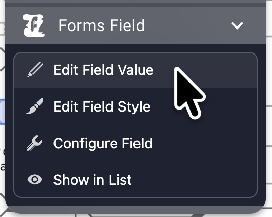
While in Build mode, drawing a new field or left-clicking on any existing field will bring up the Configure Field popover. Right-clicking on an existing field will bring up the overflow menu, within which are the dedicated options for the selected field: Edit Field Value, Edit Field Style, Configure Field, and Show in List:
Attaching Unassigned Fields
Any field that did not have a valid Character-layer image below it when it was created is an unassigned field in the Scene. These fields still operate, but only the GM can use them - they can't be owned by a player until they are attached to a suitable sheet image and that image is assigned to a player.
To attach any of these unassigned fields to a sheet, ensure that the intended sheet image is in the Character layer and is also directly underneath the field(s), then switch to Sort: By Owner in the Forms Action popover, and you will see a group called Unassigned at the top of the list. To the right of that group header is a button marked Attach to sheet that will attempt to attach each of the unassigned fields to the Character-layer image beneath them, and will then provide a pop-up 'toast' notification for the results, confirming how many fields were successfully attached and how many still had no valid target image beneath them. You will also see the sucessfully attached fields leave the Unassigned group in the Action popover and be added to their owner, and any that failed to attach will be left there.
The Field Types
Forms offers eleven field types to cover all of the common use cases that you might find on a wide range of character sheets:
| Icon | Type | What it does |
|---|---|---|
| Text | A single line of free text: names, short entries, simple plain or bold text. | |
| Multiline | A rich-text area supporting multiple lines and basic formatting (bold, italic, underline, plus plain and numbered bullet lists). Optional auto-fit scales the text to fit the field. | |
| Number | A numeric entry with optional min and max clamps to keep your values in-range. Can show optional increment / decrement buttons for click-to-adjust (see Number Steppers), accept simple mathematical changes (see Arithmetic Input), and mark positive values with a leading + (see Showing a Positive Sign). | |
| Clock | A radial display of progress that ticks up one segment with each click, and resets to empty when a full clock is clicked, with several common presets and a custom mode (see Clock Field) and optional increment / decrement buttons for click-to-adjust (see Number Steppers). | |
| Calc | A read-only value computed from a formula that references other fields by name (see Calc Fields). Can be used as a true read-only field for stats controlled by the GM, eg. 'Level'. Can mark positive results with a leading + (see Showing a Positive Sign), which suits a derived modifier. | |
| Checkbox | An optionally-grouped toggle that shows a symbol when ticked (configurable: ✓ ✗ ● ■ ◆ ★ ♥). When grouped they can optionally act as a cumulative fill-bar (see Checkbox Groups). | |
| Radio | An always-grouped toggle that shows a symbol when ticked (configurable: ✓ ✗ ● ■ ◆ ★ ♥) radios that share a group name on the same sheet are mutually exclusive, so ticking one clears the others (see Radio Groups). | |
| Dropdown | A pick-list of options you define, in the order that you choose. | |
| Button | A clickable button that rolls dice through a connected roller. Both Dice+ and Bones! extensions are currently supported, with all their rich 'dice notation' commands, as well as the Connected Dice extension that specifically handles the Draw Steel TTRPG's Power Rolls (see Dice Buttons). | |
| StatView | A read-only mirror of an external value that's stored elsewhere: on an Asset (PC token), or data from the Scene, the Room, or a Player (see StatView Fields). Useful for displaying on-token stat values on your character sheet, from extensions like Owl Trackers, GM's Grimoire, and Clash! | |
| Tooltip | A read-only reference note that the GM writes and anyone can open by clicking (see Tooltip Fields). Very useful for rules reference, lore, or reminders wherever they are needed. |
Number Steppers
Number and Clock fields can display a pair of increment / decrement buttons for adjusting their value +/-1 with a single click (this is in addition to opening a Number field and typing the new value there). Enable the steppers with the Configure Field popover's Increment / decrement buttons option, where you also choose:
- Placement: which edge the buttons will sit on (above, right, below, or left of the field).
- Glyph: the button symbols, either − + or ▼ ▲.
- Colour: choose either two white symbols, or red (decrement) and green (increment).
Like the field's own value and label, the number stepper buttons stay attached to the field as it moves, scales, and rotates, and they obey the same ownership and layout-protection rules.
Each click steps the value by one, respecting the field's min/max clamps.
Arithmetic Input
For larger jumps in a number field's value, click the field itself and type into its editor, where you can enter arithmetic as well as a plain value. The cursor sits at the end of the current value, so you can:
- append a delta like
-14to subtract 14 (eg.39-14becomes 25) - use
+,-,*,/and parentheses() - set an absolute value by selecting the current value and overwriting it
The result is clamped to any min/max, and if a clamp clips the result, the editor shows the leftover as a carry value to apply to another field; for example a 'temp stamina' field value of 15 can take -23 damage, and if it is clamped at min: 0 then it shows = 0 carry −8, reminding you to subtract 8 from your regular stamina field.
Showing a Positive Sign
Number and Calc fields can display positive values with a leading +, so that a modifier reads as +3 rather than 3. Within the field's Configure Field popover, enable the Show a leading '+' character on positive values option.
- Zero and negative values are left as they are, since they already read correctly (
0,-2) - The sign appears on the sheet and in the field list together, and the Value, Min and Max boxes in the Configure Field popover show it as soon as you tick the option, so you can see the effect even before the field holds a positive value
- It is a display choice only: the value stored is still a plain number, so calc formulae, dice notation
$Labelreferences, and the min/max clamps all continue to work exactly as before - Clock fields do not offer the option, because their central numeral counts filled segments rather than showing a modifier
Clock Fields
A Clock field is a number field shown as a radial progress clock, in the style of the segmented clocks used by Blades in the Dark and other Forged-in-the-Dark games. It is ideal for countdowns, threats, project progress, or any resource that fills up segment by segment.
- Segments: choose how many segments the clock is divided into from the presets (for example 4, 6, 8), or set a custom count for an unusual track.
- Filling it: each click advances the clock by one segment, and a click on a full clock resets it to empty, so the clock cycles; the central numeral shows the current count. Enable the increment / decrement buttons (as on a plain number field) if you would rather step the count up and down without cycling.
Because a clock is a number field underneath, its value can be referenced by $Label within Calc fields and dice Buttons just like any other number. Likewise, clicking the pencil icon next to a Clock field in your Action popover brings up the Edit Field popover where the clock can be reset to zero or jumped directly to any segment value.
Clock styling maps onto the standard Appearance controls so it sits within the same styling system as every other field:
- Filled sectors take the field's Fill colour and opacity
- The outer ring and the segment spokes take the Stroke colour; the stroke width scales the ring's and the spokes' thicknesses
- The optional central count numeral takes the Value text style, with a permanent auto-contrast outline so it stays readable over any fill colour
- The optional field label takes the Label text style, with an optional auto-contrast Outline stroke
- Unfilled segments sit on a fixed neutral track so the clock's shape always reads clearly
Calc Fields & Field References
A Calc field shows the result of a formula that uses other fields' values from the same sheet, referenced by their label, written as $Label:
$STR + $DEX / 2
For labels containing spaces, wrap them in curly braces:
${Spell Attack} + ${Proficiency Bonus}
Order of Operations
In a complex mathematical formula, the order of processing is standard:
- Parentheses
() - Exponent
^: right-associative (eg.2^3^2=2^(3^2)=512) - Unary minus
-x - Multiply / Divide / Modulo
*/%: left-to-right - Add / Subtract
+-: left-to-right
Functions
Many mathematical functions are also supported, but are not listed in the UI or suggested by autocomplete: min, max, abs, floor, ceil, round, sqrt, etc.
For example, floor ( $HP / 2 ) gives you the HP value divided by 2 and rounded down to the nearest integer.
Referencing a grouped field
Checkbox and radio fields that are in a group will have their group name in common, a bit like a family name, so two groups on one sheet can each have a "Level 1" field without clashing. To reference a specific group's member, qualify it with the group name and a slash:
${AnimalKen/Level 3} + ${Etiquette/Level 1}
A bare $Label (no group) resolves to an ungrouped field first, then to a uniquely-named grouped field. If the same label appears in more than one group and nowhere ungrouped, the reference is ambiguous: the field shows #Ambiguous until you qualify it.
The Configure Field popover offers autocomplete of available field labels as you type, including grouped members in their ${Group/Label} form, so you can pick the right group from the list. Forms evaluates calc fields in dependency order, so a calc field can reference another calc field. Circular references (A depends on B depends on A) are detected and flagged as a #Cycle error in the field's value display rather than looping forever; correcting the circular reference will resolve the error.
$Label references also work inside dice Button notation (see Dice Buttons).
⚠️ It's not possible to reference a field that is on a different sheet, although the StatView field is able to read values from other Scene items' metadata (like an on-token HP bar) and then that StatView field's
$Labelcan be used as an input to a Calc field.
Marks: Symbol or Shape
Every Checkbox and Radio field is marked in one of two ways, chosen in its Configure Field popover:
- Symbol (the default): a glyph (✓ ✗ ● ■ ◆ ★ ♥) appears inside the field when it is checked.
- Shape: no glyph at all. The field's own bounding box becomes the indicator, showing your Fill colour when unchecked and flooding with your Value colour when checked.
The Shape button sits to the left of the symbols and carries a thumbnail of the field you actually drew, so a wide ellipse shows as a pill and a squat rectangle as a bar. The two are a single choice: picking Shape clears the symbol, and picking a symbol clears Shape. If the field belongs to a group, your choice is applied to every member of that group, so a group is never half symbols and half shapes.
Shape marks suit geometric sheets: a row of pips, a stress track, a set of boxes to tick. They pair naturally with Fill Bars, where a cumulative group becomes a bar that visibly fills up. They also render identically on every device, because they use no font at all.
For a Shape-marked field, the Appearance pane's colours read as:
| Control | Meaning |
|---|---|
| Fill | the unchecked colour (its opacity still applies, so the box can stay subtle over sheet artwork) |
| Value | the checked colour, flooded at full opacity |
| Stroke | the border, in both states |
The Value row's font controls (size, weight, outline, alignment) are greyed out for these fields, as there is no text to style.
Checkbox Groups
A Checkbox field can be given a Group name in its Configure Field popover. Checkboxes sharing a group name on the same sheet are managed together: in the Action popover's field list, they collapse under one group header that shows how many of the group are ticked.
Fill Bars
Once a group name is set, a Cumulative (fill-bar) option becomes available, which changes how the boxes respond to clicks:
- Off (default): the grouped boxes stay as independent toggles. Grouping is purely for tidier organisation in the field list.
- On: the group acts as a single fill-bar, like a track of progress pips or a tier counter. Clicking the Nth box fills every box up to and including it; clicking the topmost filled box again clears just that one (stepping the level down by one); clicking any other box jumps the fill to that level.
The boxes remain separate fields, so each pip can sit at its own spot on the printed sheet while behaving as one connected meter. Reading order (ie. which box counts as "first") is taken from the boxes' positions on the sheet: left to right, then top to bottom.
Radio Groups
A Radio field can be given a Group name in its Configure Field popover. Radio buttons sharing a group name on the same sheet are exclusive to one another: only one of them can be selected at a time, and selecting a different button in the same group will cancel the previous selection. They are also managed together: in the Action popover's field list, they collapse under one group header that shows which one of the group is enabled (if any).
Create Whole Group
Once a group name is set for a radio/checkbox field, a Create whole group option becomes available, which allows you to clone the initial field many times, to speed up character sheet mapping:
- N (default '5'): the initial value proposed for a group of fields; this value can be changed to any integer from 2 to 20
- Create group of N: the confirmation button that repeatedly clones the original field, keeping its styling and Group name, and auto-incrementing its Label, laying these clones out in a diagonal cascade below and to the right of the original field.
💡 If you want grouped checkboxes or radio buttons that have identical styling, you can create the first one and set its style in the Appearance section of the Action popover, and can then return to its Configure Field popover to use the Create whole group function, which saves you from having to re-style each field in that group after they have been created.
⚠️ the Arrange extension can be used to achieve fast and accurate positioning of a group's fields over their character sheet's artwork; place the first and last field in their proper positions (and the remaining filds in approximate place between them), open the Arrange extension's popover, Hold Shift to select the first field through to the last field in the Forms popover's list, and then use Arrange's align and distribute functions to position the remaining fields quickly
Dice Buttons
A Button field rolls dice through a connected dice-roller extension. In the Configure panel you set:
- Notation: dice notation such as
1d20+5or5d6=6or4dF. You can embed field references with$Labelor${Group/Label}(e.g.1d20 + $DEX, or2d10 + ${Edges/Guidance}*2), so a button can roll using a value the player has entered or a calc field has derived. If a bare reference matches more than one group, the roll is cancelled and you are prompted to qualify it. - Roll target: who sees the result, whether everyone, just you (self), the GM/DM, or GM only.
Clicking the button in Play mode rolls the dice and shows the result to the chosen audience.
Choosing a Roller
Forms can send rolls to either of two roller extensions, chosen in the Settings panel at the foot of the Forms panel. The choice is the GM's and applies to the whole Room:
 Dice+ (default): a feature-rich 3D roller. See the Dice+ Notation Reference for the full syntax: advantage/disadvantage, exploding dice, rerolls, dice pools, Fudge/Fate dice, table rolls, and arithmetic.
 Bones!: a lighter-weight roller using Roll20-compatible notation. See the Bones! Notation Reference.
A few things to know:
- The chosen roller must be installed in the Room. Forms cannot tell whether a roller is present, so if a button appears to do nothing, confirm that the selected dice extension is enabled in your Room, and click again
- The two rollers differ in places. Notably, Bones! (Roll20) treats
>and<as inclusive (5d10>8counts 8 and up) and has no>=, whereas Dice+ uses the familiar>=. The collapsible notation help in the Configure Field popover always shows the syntax for the roller you have selected - GM+Self roll visibility is only available with *Dice+. Under Bones! it is hidden, and any such buttons set up prior to switching to the Bones! roller are shown to everyone
Zero-quantity dice
A field reference can drive a dice quantity, not just a modifier: ${Power}d6 rolls a quantity of six-sided dice equal to the Power field. Most rollers stall on a zero-quantity command such as 0d6, so when that reference resolves to zero, Forms removes the empty term before sending the roll (eg. 1d20 + ${Bless}d4 becomes 1d20 alone when the Bless variable is numerically zero or logically 'false'). If every dice term resolves to zero and there's nothing left to roll, then the button tells you so in a notification rather than sending a dice command that never completes.
Power Rolls (Draw Steel)
A dice button has a second mode for the Draw Steel system's signature Power Roll (2d10 plus modifiers, read as one of three success tiers). Tick Power Roll (Draw Steel) in the Configure panel and the dice-notation field is replaced by Power Roll controls:
- Bonus: a flat modifier added to the roll. Like notation, it accepts field references (
$Might,${Group/Label}), so the bonus can track a characteristic the player has entered. Leave it blank for no bonus - Has skill (+2): adds the Draw Steel skill bonus. Skills apply to tests, not ability rolls, so this is a manual toggle
- Edges − Banes: the net result of edges (1 edge gives +2, or 2 edges gives a one-tier-higher result) and banes (1 bane gives -2, or two banes gives a one-tier-lower result), from −2 to +2. Connected Dice calculates the success tier from the result
- Dice: roll a straight 2d10, or keep the highest 2 / keep the lowest 2 of three d10s (ie. specifically for a L2 Conduit's Blessing of Fate and Destiny ability, and a L8 Fury's Menagerie ability)
Power Rolls are sent to the  Connected Dice extension, which must be installed and enabled in this Room. This is independent of the Dice+ / Bones! choice above: one sheet can use a Dice+ button for generic rolls and a Power Roll button (for a Draw Steel test) at the same time. The Connected Dice extension rolls the dice and shows the resulting tier in its own dice tray. Forms also keeps the most recent Power Roll at the top of its Action popover because Connected Dice's tray has no roll log, so this holds the last result to hand; dismiss it with the
 × button and it returns to show your next roll.
StatView Fields
A StatView field is a read-only window onto a value stored somewhere else in the Room. It never accepts typed input; it mirrors its source and updates when that source changes. Sources can be:
- Item: metadata on another Scene item (for example, an HP value another extension writes onto a token)
- Scene: a value in the Scene's metadata
- Room: a value in the Room's metadata
- Player: a value on a particular player's metadata
When you configure a StatView field, Forms offers an auto-discovery tree of the metadata it can find, so you can browse and click the exact value to mirror rather than typing a path by hand. Because a StatView field surfaces a plain value, it can also be referenced by $Label from calc fields and dice buttons.
When listing the available metadata values in the Configure Field popover, some well-known extensions are described by their public names, like Owl Trackers and Draw Steel Tools and Trackers, while others are described by their development name, like com.dddice or com.battle-system.forge.
Tooltip Fields
A Tooltip field holds GM-authored reference content (a spell description, a rules reminder, a piece of lore) written as rich text in the Configure panel. In Play Mode, anyone can click the field to read its content in a popup. It is universal (not gated by ownership) and never editable by any player, so it is ideal for in-context rules help or world lore that sits right on the sheet where it is needed.
The Field List
The Action popover lists every field in the Scene, with tools at the top of the popover to help you find the one you want:
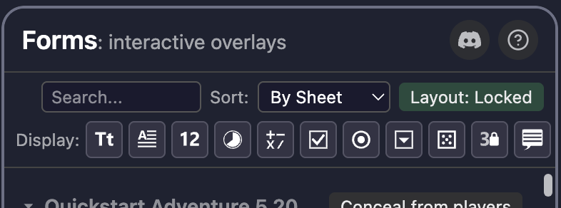
- Search through all fields' label text and field values
- Sort (ascending or descending) by sheet image, field label, field value, field type, or owner
- Display by field type, with eleven icon buttons that toggle their visibility
The Display row also allows you to Alt-click one of its icons to 'solo' it (eg. Alt-click on the Number icon to show only Number fields), and then Alt-click on it again to go back to the original display selection.
Each row in the field list shows the field's type, its label, its value, and an Edit Field Value button (pencil icon); the GM also has three more quick action icons for restyling, configuringg, or deleting each item.
A single-click on any list item will add a red highlight to that item and to its field in the Scene, allowing the user to correlate Scene fields with their position in the list. A double-click on any list item will pan the user's viewport so that the field is centred for them, allowing them to see the exact position of any list item in the Scene.
The list and the Scene stay in step; whenever a field in the Scene is selected (only possible when the GM is in Build mode, or when a marquee-select has multi-selected more than one filed), the user's list is updated to add red highlighting to the list item(s).
Styling Fields
Open the Appearance panel at the foot of the field list to control how fields look:
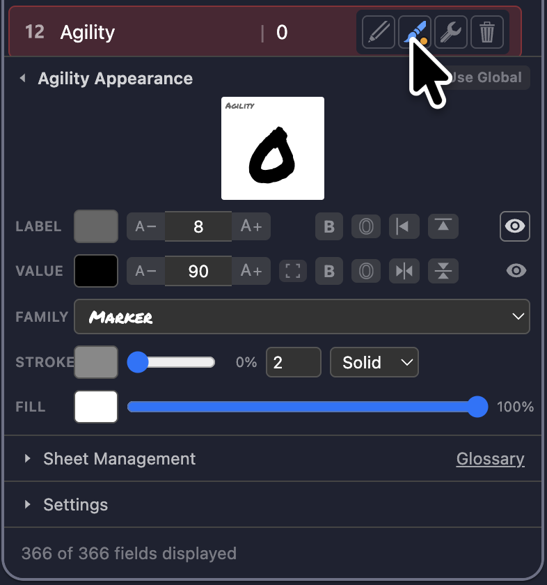
Styling works at two levels:
- Global style: the default applied to every field in the Scene. Set it once and all fields follow.
- Per-field override: style a single field differently via its Edit Field Style button and that button will how an orange dot to indicate it diverges from the global default style. A Use Global button reverts it to the Scene default at any time.
The upper section shows a live-preview of the current style, which updates immediately with any parameter changes made on the controls below it.
The lower section has five rows of controls:
- LABEL: the name of the field in the list and (optionally) in the Scene,
- font colour swatch with numeric input and an eye-dropper
- press'n'hold font size rocker with numeric entry (1-400)
- bold weight toggle
- outline style toggle
- horizontal alignment 3-way toggle (left/centre/right)
- vertical alignment 3-way toggle (top/middle/bottom)
- visibility toggle (defaults to hidden)
- VALUE: the contents of the field as seen in the list and in the Scene
- font colour swatch with numeric input and an eye-dropper
- press'n'hold font size rocker with numeric entry (1-400)
- autofit toggle - only available on Multiline fields
- bold weight toggle - not available for Multiline fields
- outline style toggle
- horizontal alignment 3-way toggle (left/centre/right)
- vertical alignment 3-way toggle (top/middle/bottom)
- visibility toggle (defaults to visible)
- FAMILY: dropdown picker of all seven familiar OBR font family options, and Line spacing rocker (1.0-2.5) - only available on Multiline fields
- STROKE: shape outline for all field types except Clock, where is is the ring and segment spokes
- colour swatch with numeric input and an eye-dropper
- opacity slider (0-100%)
- thickness value (1-10)
- line style picker (Solid/Dashed/Dotted)
- FILL: shape background for all field types except Clock, where is is the filled segment colour
- colour swatch with numeric input and an eye-dropper
- opacity slider (5-100%), capped at 5% minimum, to ensure a valid click target
Whenever the Appearance panel is open, its top line shows the current style, which is either Default Field Appearance when no individual field is being edited there, or [Field Label] Appearance when a specific field is being edited.
Default Field Appearance:
- applies to all fields until they have their own divergent style applied, so that new fields have a consistent style given to them on creation
- when this style is altered, two options appear at the head and foot of the Appearance panel, a green Apply Style Changes button at the top, and a red Undo Style Changes button at the bottom, which provide the GM with an explicit accept/discard decision that is immediately executed when one of those options is selected
[Field Label] Appearance:
- applies only to the named field, and you will see confirmation that this styling has diverged from the default field appearance by a small orange dot on its brush icon in the Action popover's list
- whenever the field's styling has diverged from the default field appearance, a grey Use Global button appears at the top fo the Appearance panel, allowing the GM too conform this field to the global standard.
Field previews are rendered with a faithful text-measurement engine using the exact fonts Owlbear Rodeo draws with, so what you see while styling matches what lands on the canvas.
Format Paint: Copying One Field's Look to Many
Styling fields one at a time is slow work on a large sheet. Format Paint copies a chosen set of parameters from one field onto as many others as you like, in one action.
The workflow is: style one field, then multiselect to paint it onto the others.
- Style a single field until it looks exactly right.
- Select it, then Ctrl- or Shift-click (or marquee-select on the canvas) to add the fields you want to match it. The first field selected is the one being copied from.
- The Appearance pane retitles itself Format Paint from [Field Label] in red. While it is in this mode the controls no longer edit anything: clicking a control arms it for copying instead, marking it with a red outline. Click it again to disarm it.
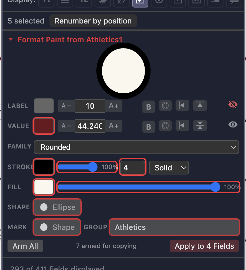
- Press Apply to N [type] fields to confirm, and see the success result "Painted onto N fields" next to that button:
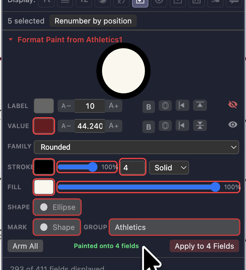
Only the parameters you armed are copied. Every other parameter on the target fields is left exactly as it was, and the field being copied from is never altered.
A few things worth knowing:
- Arming is deliberate, so nothing is copied by accident. A fresh selection starts with nothing armed, and the pane tells you how many parameters are armed for copying.
- A parameter you cannot copy is greyed out. A parameter is only offered when every selected field has it, so eg. Line spacing is unavailable unless all the selected fields are Multiline.
- You can paint across different field types. Colours, fonts, sizes and alignments are shared by every field type, so styling a mixed selection together is perfectly normal.
- Three extra parameters sit below the style controls:
- Shape: the field's bounding shape, rectangle or ellipse. Painting it preserves each field's position and size, so nothing moves. This is the quick fix for a set of rectangular fields sitting over round artwork. It is unavailable if any selected field is a Clock, which is always circular.
- Mark: for checkboxes and radios, the check symbol (or the filled-shape mark).
- Group: for checkboxes and radios, the field's Group name, which joins the painted fields to that Group.
- Mark and Group need a single field type. They are only offered when every selected field is the same type: a Group shared between checkboxes and radios would really be two separate groups, so it is not allowed. Painting a Group also carries the mark across, since the members of one Group should look alike.
- Painting a field's style gives it its own divergent style, so it will show the orange dot on its paintbrush in the field list. Use Global still returns it to the Scene default at any time.
⚠️ Undoing a paint may take multiple quick presses of Undo. Because a format paint can change several aspects of the recipient fields at once, Owlbear Rodeo's native Undo function unwinds it in stages rather than all in a single step: the Style, MARK/GROUP, and SHAPE changes each count as one separate stage. To roll a whole format paint back, press Undo in quick succession - once for each of these stages - as one burst. Eg. if you painted a few Style parameters and also applied a GROUP label then that would need two Undos to fully revert those changes. If you painted the MARK and SHAPE parameters then that would also need two Undos. Painting Style, and MARK, and GROUP, and SHAPE changes would be three Undos (because all Style changes are one stage, and MARK + GROUP are also one stage)
If you painted several changes and then Undo just once and pause, you may see the change briefly revert and then return: that is expected, so quickly Undo as many times as you need until the fields are back as they were. Either way, a paint is never left half-reverted, so you will not be left with a messy in-between state to untangle.
Protecting Field Layout
Once a sheet is laid out, you don't want fields drifting away from their proper location on the sheet mid-session. All fields have a global layout protection setting shown in the top-right corner of the Action popover:
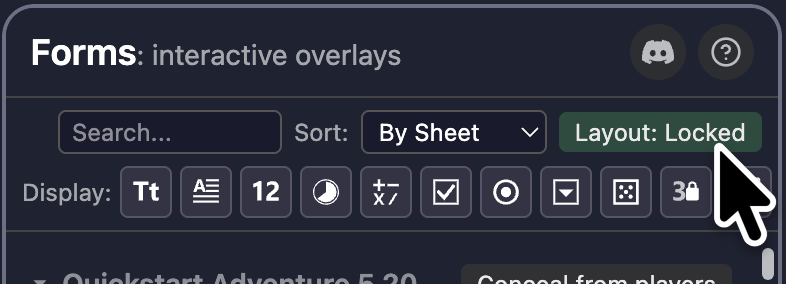
- Layout: Locked: the field's position, size, rotation, and shape are fixed. Players (and accidental drags by a GM) cannot permanently change these, they snap back to their authorised place by a background enforcer task; the GM can only change their layout when they are in Build mode (which is not available to players)
- Layout: Editable: each field can be freely repositioned and resized by its owner (the player and/or the GM)
Layout: Locked uses an auto-revert guard: if an unauthorised change to a field's geometry is made, it is snapped back to its authorised layout as soon as possible. The GM's changes are treated as authorised whenever they have activated Build mode (so those changes are not reverted), allowing them to rearrange fields without having to switch to Layout: Editable for everyone in the Room.
This auto-revert is usually immediate, but if you are in Layout: Locked and you see some unauthorised changes (eg. made by a player) that are not being reverted, then it's likely that the nominated enforcer is busy or has experienced a brief network disconnection - but don't worry, those changes will be fixed when the enforcer is back online again! If the enforcer has left the Room, another one is elected from the remaining members in the Room.
Moving, scaling, or rotating the sheet image carries all its fields with it: the whole form travels as one, so a player can reposition their character sheet where is suits them, and even Lock it in position, while the fields on it retain their proper places and can still be click-edited directly.
Concealing a Sheet from Players
When you are preparing a sheet that you are not ready to show, or are running a GM-only tracker in the Scene (like a negotiation, a montage, or an NPC's sheet), you can hide an entire sheet - including its image and all of its fields - from your players, while keeping a fully-opaque copy for yourself. This is an upgrade from OBR's in-built Hide function, which makes the object completely invisible to players but also shows the GM a semi-transparent version that can be low-contrast and hard to read.
In the Forms popover, sort the field list By Sheet, and each sheet's header gains a Conceal from players button (GM-only). Click it and:
- Players no longer see that sheet image or any of its fields
- You (the GM) still see the sheet, drawn as a crisp local-only copy, so you can keep reading and editing it as normal
- each of the corners of the sheet image will be overlaid with the
 GM-only icon, as a visual confirmation that the whole sheet is hidden from your players
 - The sheet is indicated as hidden in the field list by its button changing to Reveal to players; click it to make the sheet visible to everyone
Note that this feature is also available by right-clicking on a character sheets in the canvas and selecting Conceal from players there, which then becomes a Reveal to players toggle when the sheet is hidden and the four corner markers are added to it.
If any of the GM-only icons is obscuring part of the sheet, you can click-drag to reposition them, or delete one or more of them will no ill effect - however, it would be prudent to leave at least one of them visibkle as a visual reminder that this sheet can't be seen by players. Any GM-only icon that's dragged completely off the sheet will be deleted, and all four icons will be added afresh after a tab reload.
⚠️ This is a visual convenience, not a secrecy guarantee. A hidden sheet's data still lives in the Room's metadata, so a technically-minded player could in principle read its values through the browser console. Use it to declutter the table and run sheets your players have not reached yet, not to store information that you absolutely must keep secret from technically-capable players!
💡If you need this ability to conceal an image and all its attachments from your players in a Room or a Scene where Forms' full feature-set is not needed, you can instead use the Conceal extension, which is the stand-alone version of this one capability!
Sheet Management
Laying out a character sheet is the one job in Forms that takes real time, and you should only have to do it once. The Sheet Management section of the Action popover (GM-only, and collapsible like Appearance and Settings) is where a finished sheet becomes something you can reuse anywhere:
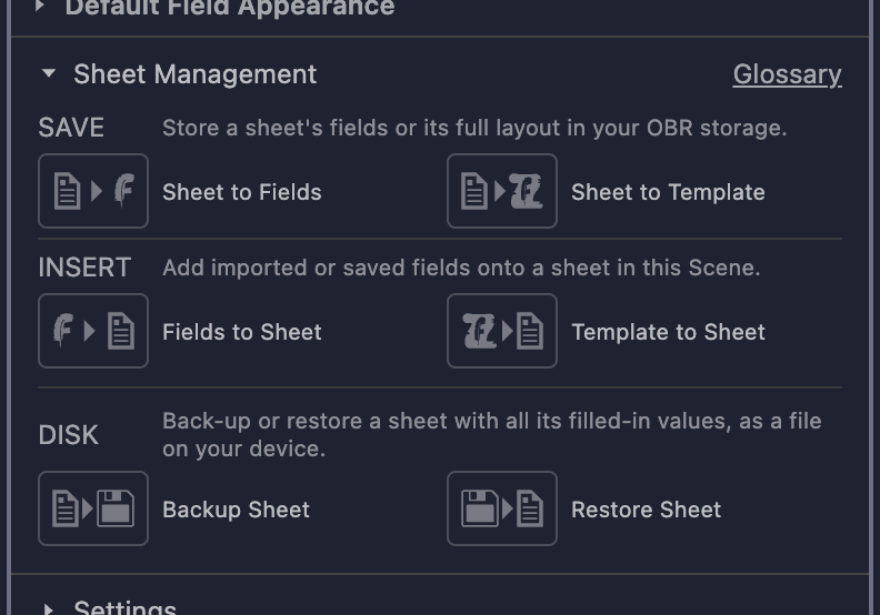
Everything here is a SAVE (to your OBR cloud storage), or an INSERT (into the current Scene), or a DISK operation (to or from your device's hard drive), laid out as a grid of six buttons:
| Field set | Template | |
|---|---|---|
| SAVE | Sheet to Fields | Sheet to Template |
| INSERT | Fields to Sheet | Template to Sheet |
| DISK | Backup Sheet | Restore Sheet |
A SAVE takes a live character sheet within the current Scene and produces a stored artefact (a Field Set or a Template) in your own Owlbear Rodeo cloud storage for use later; an INSERT takes one of those OBR-stored artefacts and adds it into the current Scene; a DISK allows you to backup or restore a filled-out sheet with all its values to your device's local hard drive. Hover any button for a one-line description, and the Glossary link in the section's header explains the terms (Field, Field Set, Template, and the rest) in case any are unfamiliar.
A saved artefact comes in three kinds:
- a Field Set carries the fields' setup alone (no values), for a sheet whose image is not yours to pass on: the recipient drapes your fields over the copy of the artwork that they already own
- a Template carries the artwork's image URL and the fields' setup (no values), for a sheet whose image is yours to reuse (a sheet image already in your cloud storage, your own artwork, a Creative Commons or open-licence sheet, or a homebrew scan you made yourself)
- a Sheet carries the artwork's image URL, the fields' setup, and the fields' values, for backing-up or restoring a complete sheet to or from your hard drive
Sharing the Fields Without the Artwork
Most published character sheets are somebody else's copyrighted artwork. You can lay out a beautiful Forms overlay for one, but you cannot hand the sheet image to another GM, and a sheet template carries the image with its fields. A Field Set is the answer: it saves your fields and nothing else, so what you pass on is your own work, and each GM who receives it lands it on the copy of the sheet they already bought.
Sheet to Fields saves the chosen sheet's fields without its image (again with the sheet dropdown when there is more than one). The name begins Fields -, which keeps field sets and sheet templates out of each other's pickers.
Fields to Sheet opens a picker of your saved field sets, then asks you to click the sheet image in your Scene to drape the fields over. A click on anything that is not an image is ignored, so a misclick costs you nothing but another click.
The fields are stored as fractions of the sheet they were drawn on rather than as fixed positions, so they fit whatever size of sheet you land them on: a field set captured from a small image lands correctly on a large one, and the fields' text size scales with them, so the values are still legible at the size you meant them to be.
If the sheet you drop them onto is a different shape from the one they were drawn on (eg. a landscape sheet when the fields were laid out on a portrait one), Forms tells you so, because the fields will be stretched and may be out of alignment with the printed boxes underneath. Any StatView fields will also need their sources re-picked, since the token they were originally reading from is probably not in this Scene; the message after an insert says how many StatView fields need to be re-linked.
⚠️ To export or import a template or a field set, you can use the same OBR functionality that you use to backup and restore Scenes and image assets: Open the Extras menu (the three-dot button in the lower-left corner of your Room), then select Manage Storage, and finally click on the Export Backup icon (the cloud with a download arrow on it) or the Import Backup icon (the document with an upload arrow on it), then select what you want to export or import to/from the .ob2 archive file that OBR uses.
Saving a Sheet as a Template
Sheet to Template saves a sheet complete with its image and its fields. If more than one sheet in this Scene has fields on it, a dropdown appears so you can pick which one; with only one, it goes straight to naming. Name it, and Forms opens your Asset Manager's Scenes category for you to file the new template wherever you want to store it. Every template's name begins Forms -, which is what makes it findable later, so that prefix is fixed and only the rest of the name is yours to write.
Template to Sheet opens a picker showing only your Forms templates, and adds the one you choose to the current Scene: the sheet image and every field that belongs on it.
A template keeps everything about its fields except their contents: the types, labels, styling, checkbox and radio groups, calc formulae, dice notation, symbols, and marks all travel with it but the values land blank, ready for whoever fills the sheet in. A template is a blank form, not a copy of a filled-in one, so saving your Fighter's sheet as a template does not save your Fighter's stats or other values.
An inserted template is a copy. It belongs to you in this Scene, and filling it in, restyling it, or drawing new fields on it leaves the saved 'master copy' of the template untouched within your storage, ready to stamp out the next character sheet.
💡 Templates are Scenes in your own cloud storage, the same trick the Prefabs extension showcased, so they cost you almost no space to keep and are yours to use in any Room.
⚠️ Forms cannot tell whether you completed the save: the Asset Manager takes over as soon as it opens, and it never reports back. So there is no "Saved!" message, by design, rather than by omission. The Asset Manager is your confirmation, and your template appears there under its Forms - name.
Finding Your Templates Again
Templates and field sets sit among all your other Scenes in the Asset Manager, so Forms marks them in two ways:
- By name. Every template begins Forms - and every field set begins Fields -, and each picker searches on its own prefix, so Template to Sheet never offers you a field set, and Fields to Sheet never offers you a sheet template. This matters more than it sounds: a GM who inserts a template when they meant a field set gets a duplicate of the very artwork they meant to leave behind
- By badge. A sheet template's thumbnail is stamped with the Forms
 scroll, indicating that it is a full character sheet and includes the underlying image artwork as well as all your Forms fields, and a field set's thumbnail is stamped with the Forms
  quill, indicating that it includes all of your drawn and configured fields but no sheet image, so the two kinds are distinct from each other and from your ordinary Scenes at a glance.
A field set has no artwork to show, so instead of a picture of the sheet, its thumbnail draws the outline of the sheet the fields were captured from, with the fields laid out on it in blue or green to match the owner-only/public nature of each field: you recognise the overlay by its pattern.
💡 The badge is decorative, and Owlbear Rodeo regenerates a Scene's thumbnail from your viewport a short while after you open it as a Scene in its own right (eg. to edit it), which paints over the badge. Nothing is broken if that happens: it is the name that keeps a template findable, and the name survives. There is no need to re-save the template to get its badge back
Backing Up a Filled-In Sheet
A Field Set and a Template are both blank by design: they capture a sheet's layout to stamp out fresh copies, so they leave every value empty. To keep a sheet with its filled-in values (a specific character mid-campaign, or a snapshot before a risky change), use Backup and Restore instead. They sit in their own DISK row at the foot of Sheet Management, set apart because they save to a file on your device, not to your OBR cloud storage.
- Backup Sheet writes the sheet, its artwork reference and every field's current value to a
.forms.jsonfile that your browser downloads. With more than one sheet in the Scene, you first have to pick which one you want to export - Restore Sheet reads one of those files back, recreating the sheet and its fields - values and all - in the current Scene at the centre of your current viewport position
💡 The file is plain, readable JSON: open it and you will find a description of what it is, the sheet it came from, and a listing of every field and its value.
⚠️ The artwork is stored as a reference to the image in your OBR storage (ie. the image itself is not embedded), so although your backup files are kept small, a restore needs that character sheet image to still exist in your OBR account. Restoring into the same Scene keeps everything as it was; restoring into a different Scene may need any StatView fields that mirror a token or player re-linked (and the restore will warn you how many there are).
Troubleshooting
"I drew a field but it didn't attach to my sheet"
- Make sure the sheet image is on the Character layer and sits beneath where you drew. Fields attach to the highest Character-layer image under the field's box
- If there is no Character-layer image under the field, it has nothing to attach to
- If you reposition any unattached fields over their intended Character-layer sheet, and then sort the list "By Owner", you will see all Unassigned fields grouped together and can click the "Attach to sheet" button in their header to trigger attachment for them
"A player can't edit their field"
- Field editing follows image ownership. Check that the player owns the token/image the field sits on (left-click select the image → Owner)
- Read-only types (Calc, StatView, Tooltip) are never player-editable by clicking, that's by design, they can be edited by the GM in Build mode though
"A calc field shows an error, `#Cycle`, or `#Ambiguous`"
#Cyclemeans two or more calc fields reference each other in a loop. Break the loop so dependencies flow one way only#Ambiguousmeans a bare$Labelmatches fields in more than one group (and no ungrouped field has that label). Qualify it with the group:${Group/Label}. The autocomplete offers the qualified forms- Check that every
$Labelin the formula matches an existing field's label exactly. Wrap labels with spaces in braces:${Like This}
"A field keeps snapping back when I move it"
- The Layout: Locked mode is in effect (seen in the top-right corner of Forms' Action popover) and you are in Play mode (because the Build mode tool is not selected). Either switch to Layout: Editable in the Action popover (affects everyone), or enter Build mode (affects the GM alone) to reposition that field.
"A field isn't snapping back when it was wrongly moved"
- Either:
- Layout: Editable mode is in effect (seen in the top-right corner of Forms' Action popover), or
- the GM was in Build mode and made that change, or
- the unauthorised change is simply queued and waiting to be reverted by a distracted or disconnected enforcer. This will usually resolve itself in a short time, but the GM can also manually correct the file's geometry via Build mode if they don't want to wait for the enforcer to respond.
"My fields disappeared or didn't save"
- Forms stores everything in the Scene's metadata. Make sure you are in the same Scene: fields are per-Scene.
- Confirm the extension is enabled for this Room - if it is then you'll see the Forms Action icon appear at the edge of the screen, usually the top-left corner unless you have previously repositioned it.
Support
Owlbear Rodeo's Discord is the community hub for all extensions. Join via this invite link: https://discord.gg/u5RYMkV98s and search for Forms in the extension channels, or open a help request in #extension-help.
Privacy & Data
Anonymous performance metrics.
Forms collects anonymous performance metrics in two sets.
Always-on metrics:
- Forms' version used
- anonymised Room ID (to de-duplicate reports)
- quantity and type of fields used
- quantity of character sheet images
- quantity of 'extra' features used (number steppers, concealed sheets, checkbox fillbars, etc)
Opt-out metrics:
- errors experienced
- incomplete field configs
- unknown extensions used for StatView fields
These are collected to help support and improve the extension and no personal information is ever collected. The GM can enable the Metrics: no error/behaviour counts option in their Settings page to remove the "error_count", "incomplete_config", and "new_StatView_namespace" values from the metrics, which although useful for support purposes do reveal anonymised behaviour.
The "new_StatView_namespace" telemetry allows Forms to send the development namespace of any unknown extension used in a StatView field, so that they can be added to the lookup table: eg. so we can replace com.bitperfect-software.hp-tracker/data with the much friendlier GM's Grimoire name! These messages are:
a) only sent for extensions that don't already exist in our lookup table b) only sent for extensions that have been added to a StatView field c) truly anonymous by design - they are a separate message to the rest of the telemetry data, "this unknown extension was linked to a StatView field", with zero identifying information so that it can't be correlated with your other anonymous metrics
Once a new and unknown extension has been reported in this way, we will find its published name, add it to our lookup table, and then update the Forms extension to include that information, so that existing and future StatView fields linked to the extension will show its proper name, making it much easier to understand what the StatView field is presenting.
Session data are retained for up to 4 years. If you do not consent to providing any performance data then you must not use this extension.
Local to your Room.
All field definitions and values are stored in your Owlbear Rodeo Scene and item metadata under the com.several-record.forms namespace. This data lives in your OBR Room and persists as part of it.
No third-party content.
Beyond the bundled fonts (see below), Forms ships no external assets, and only reports performance telemetry with the level of detail that you choose.
Font Credits
Forms bundles the seven text fonts available in Owlbear Rodeo so that field text is measured and previewed with the exact glyph metrics OBR renders with. Licence files are included in the extension package under public/fonts/.
| Font | Copyright / Author | Licence |
|---|---|---|
| Roboto | Copyright 2011 The Roboto Project Authors | SIL Open Font Licence 1.1 |
| Dancing Script | Copyright 2016 The Dancing Script Project Authors | SIL Open Font Licence 1.1 |
| Courier Prime | Copyright 2015 The Courier Prime Project Authors | SIL Open Font Licence 1.1 |
| EB Garamond | Copyright 2017 The EB Garamond Project Authors | SIL Open Font Licence 1.1 |
| Permanent Marker | Google Fonts | Apache Licence 2.0 |
| Lemon Tuesday | No copyright notice in bundled file | SIL Open Font Licence 1.1 |
| Gotica Bastard | Manfred Klein: no licence file; believed public domain | Public domain |
The faithful text-layout engine (src/lib/textLayout.ts) is ported from the Snaps extension's Note renderer.
Icon Credits
| Icon | Description | Author | Licence |
|---|---|---|---|
| Field-type, tool, and interface icons | Field types, the Build tool, and UI controls | Lorc and Delapouite via game-icons.net | CC BY 3.0 |
Icons are adapted from their original game-icons.net SVG sources (recoloured via currentColor for theme support, and resized) for use in Owlbear Rodeo.